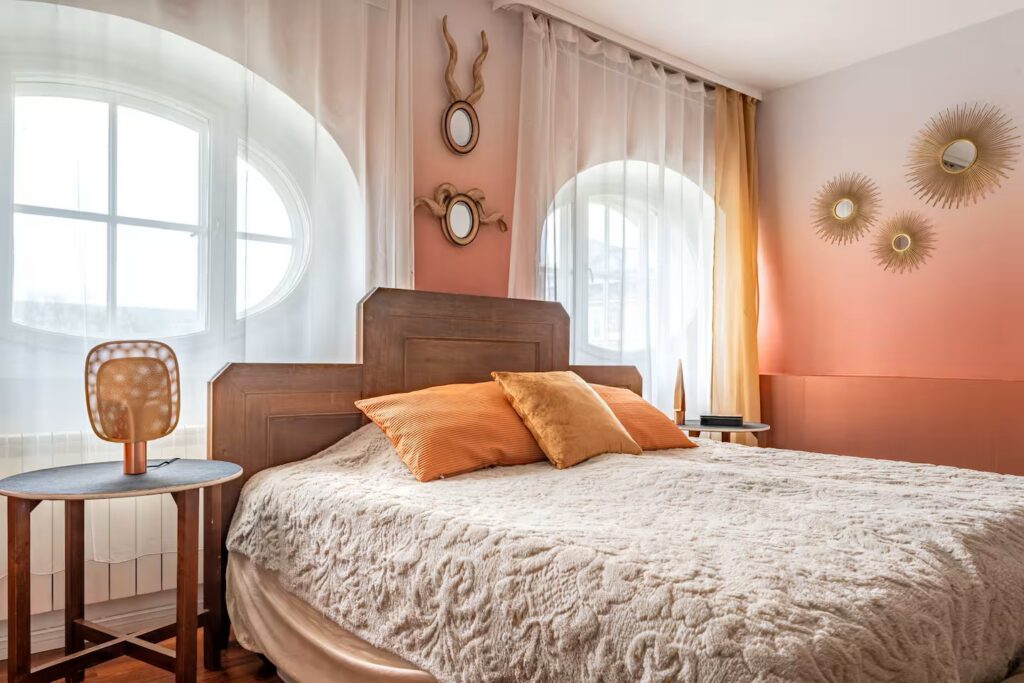
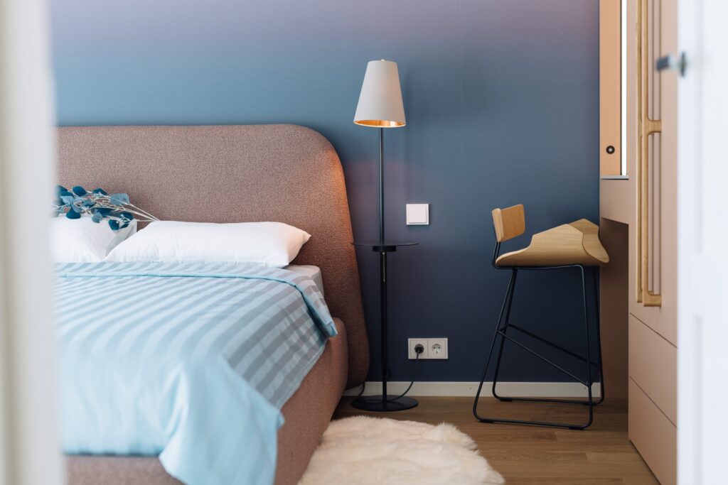
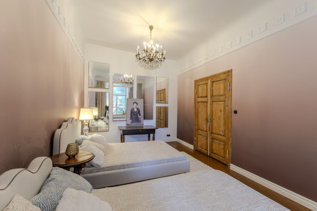
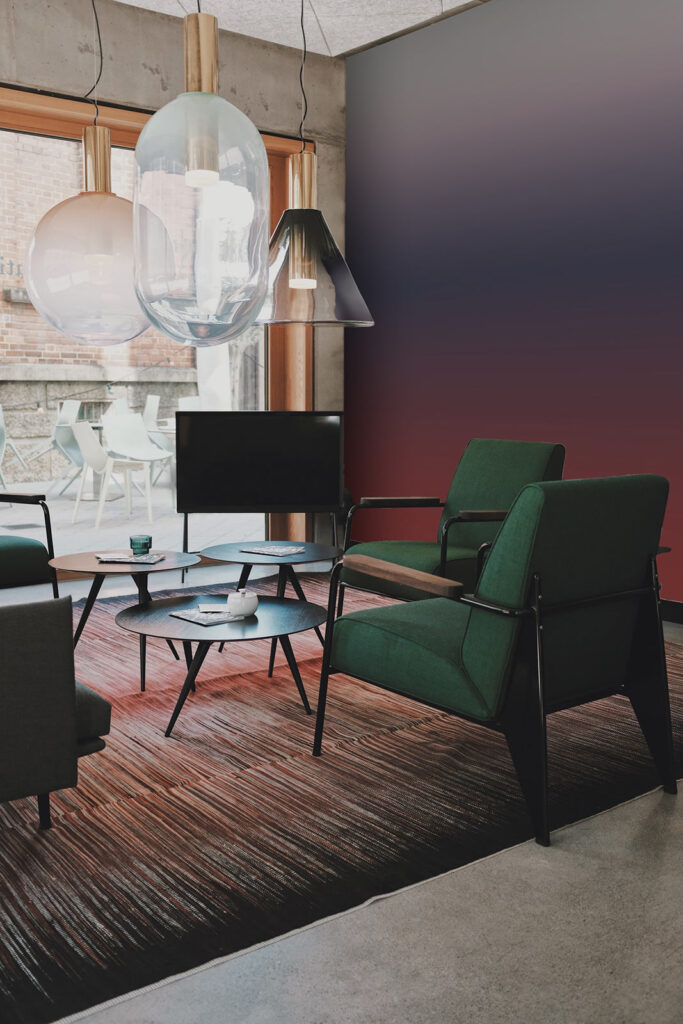
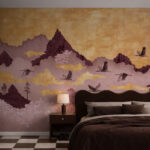
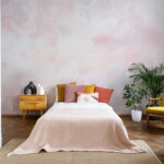
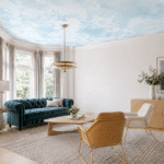
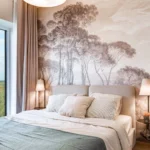
The art of the fade: ombre wallpapers
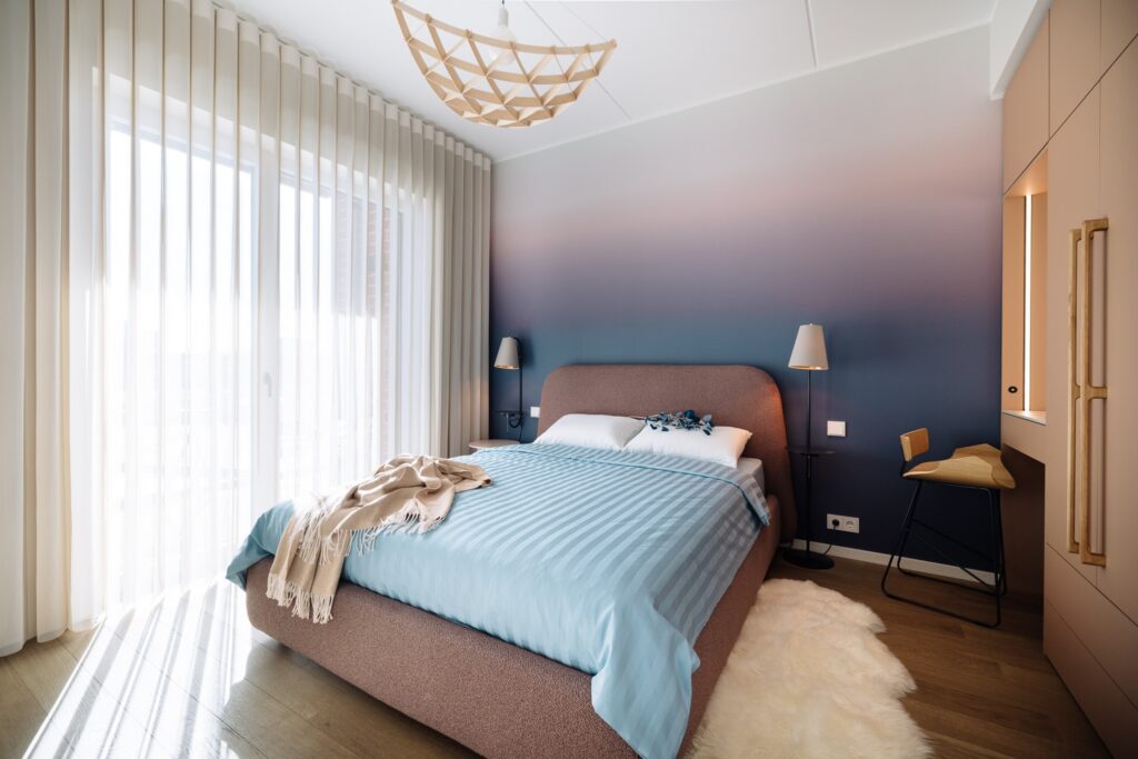
Ever feel like your walls are a bit too “flat” for the room’s potential? Enter the ombre wallpaper, also known as gradient effect: the ultimate design trick for adding dimension without the visual noise.
The term stems from the French ombrer, meaning “to shade,” and its roots are deeply tangled in 19th-century textile dip-dyeing and intricate weaving. In fact, some of the earliest “rainbow papers” were produced back in 1820 by the legendary Zuber factory in France.
Today, gradients are dominating our feeds. It is because they mirror the organic transitions of the natural world, from desert sunsets to morning mists. This connection to the horizon line is a psychological “breath of fresh air” that helps reduce cognitive load in our high-speed digital age.
We’ve seen the ombre effect travel everywhere. From high fashion runways and iconic hair transitions to the sleek, liquid gradients of our favorite smartphone interfaces. It works because it bridges the gap between two colors without a harsh divide, making even a compact room feel serene.
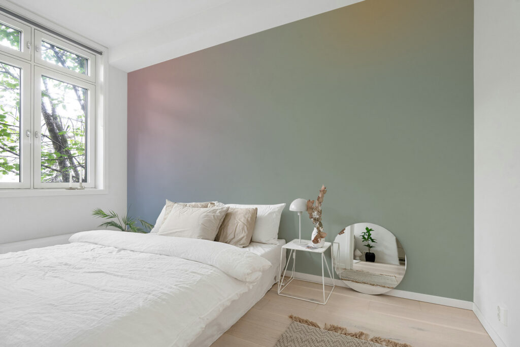
Whether you’re leaning into “soft tech” blues or a warm, “dusk peach” glow, the gradient effect wall is about creating an atmosphere rather than just picking a paint chip. If your space needs a soul, let it fade. Afterall, sometimes the most powerful statement is the one that knows how to blend in.
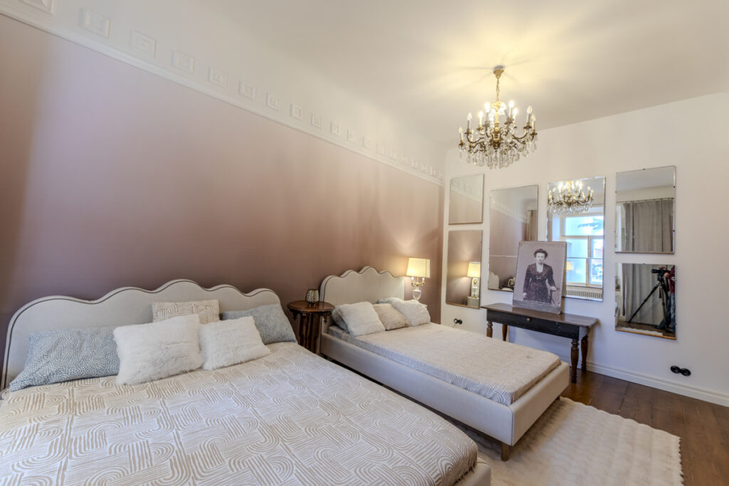
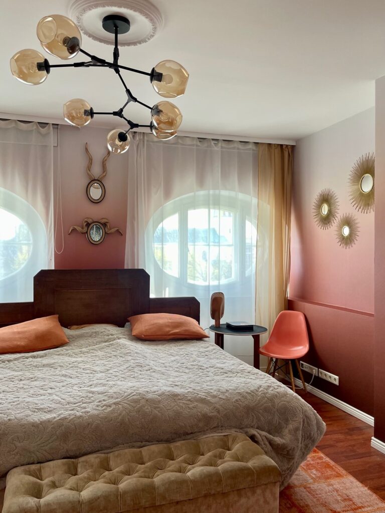
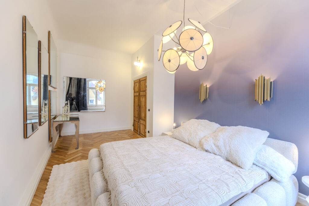
Browse the small gallery of gradient effect walls below at homes and see the various ombre wallcoverings here.