Back
Back
The art of the gentle fade: ombré wallpaper
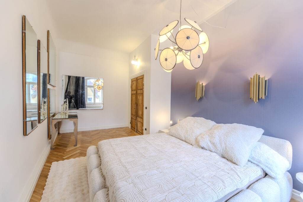
Some walls deserve a sunset of their own. A little blush slipping into cream, perhaps, or an inky blue that slowly loses itself in the palest sky. Ombré wallpaper brings that gradual shift indoors, giving a room colour with room to breathe.
The name comes from the French ombré, meaning “shaded”. Its defining feature is a gentle graduation, usually from light to dark, without an abrupt dividing line. The effect has a long decorative history: shaded textiles were popular in Western Europe from the 1840s, with printed ombré fabrics travelling from France and England to American ports. Long before the dip-dyed hairstyle, there was the beautifully shaded cloth.
For walls, you’ll also encounter terms such as gradient wallpaper, colour-fade wallpaper and dégradé. Some designs are smooth and almost cloudless; others have the drifting edges of watercolour, with pigment appearing to gather and dissolve across the surface.
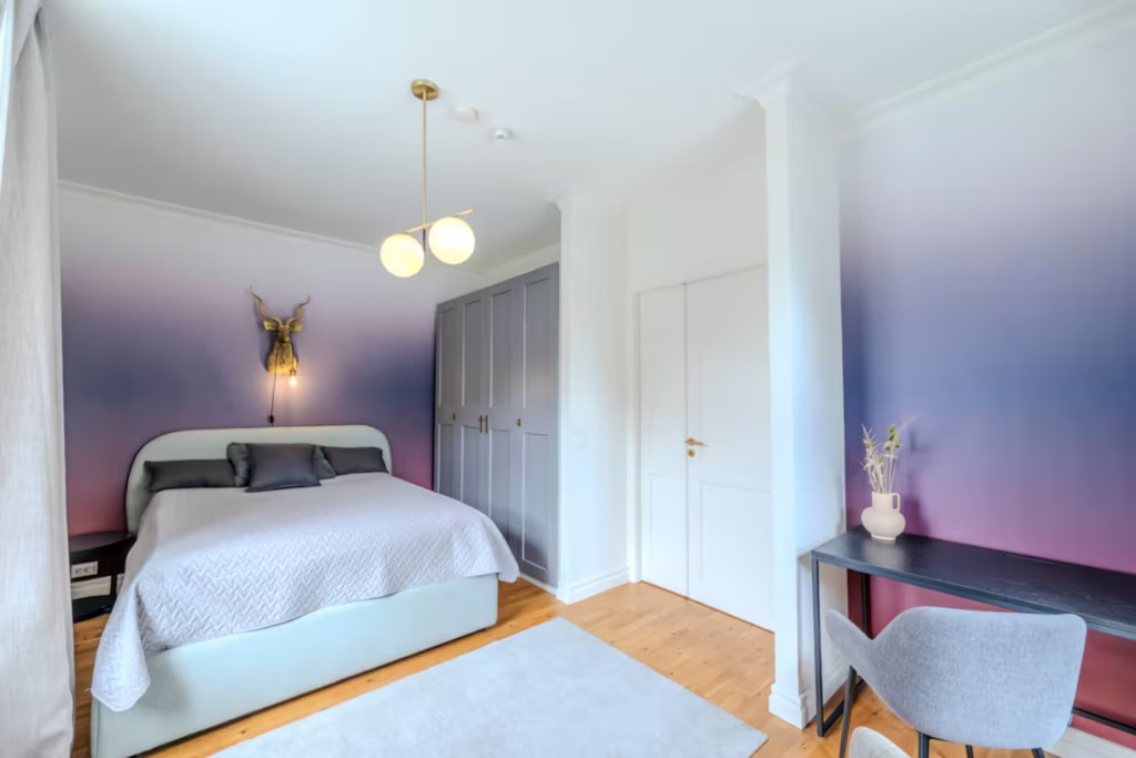
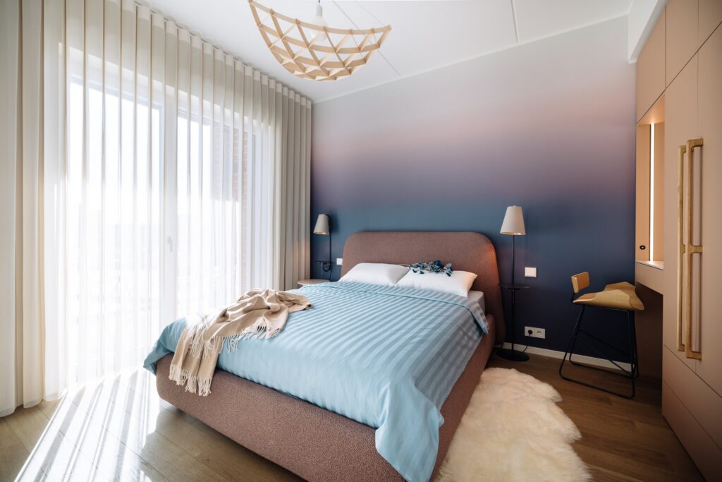
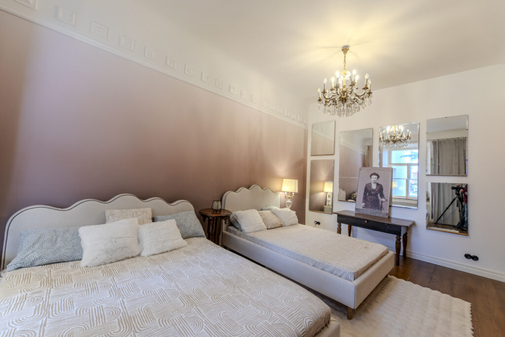
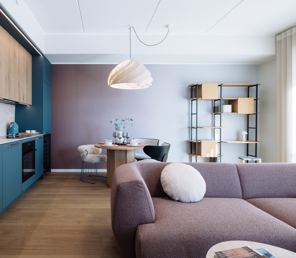
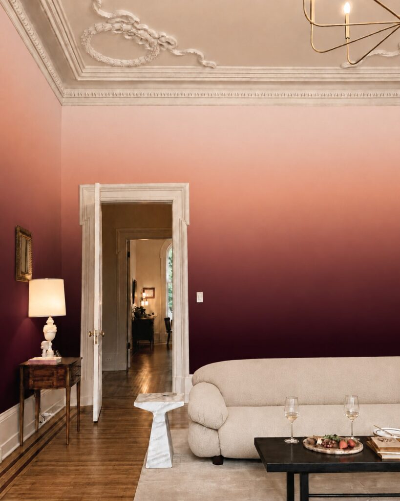
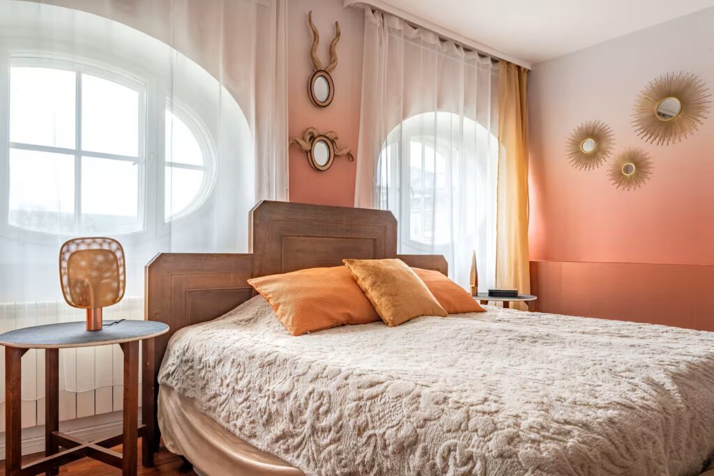
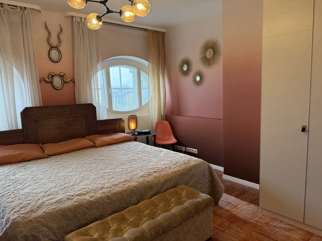
Much of the appeal lies in the mood. In a bedroom, dusty rose fading into warm ivory makes a lovely companion for rumpled linen and pale timber. Misty blue and grey suggest an early morning by the sea, while terracotta shades bring warmth to a living room with walnut furniture and a generously upholstered sofa. Deep petrol green offers a moodier take, particularly beautiful beside brass and dark wood.
The trick is to consider where the colour falls. A darker section near the floor can give the scheme a grounded feel, while a pale upper section keeps things visually light. Check the mural’s placement against your headboard or sofa before ordering: the loveliest transition deserves to be seen.
Then borrow a shade from the wallpaper for a cushion, throw or lampshade. The wall has already done the colour-matching for you. How thoughtful.